 Head over to the 11secondclub and check out BJ Crawford's winning entry, which is again awesome!!
Tuesday, December 29, 2009
11 Second Club November Winner - BJ Crawford
 Head over to the 11secondclub and check out BJ Crawford's winning entry, which is again awesome!!
Friday, December 25, 2009
Wednesday, December 23, 2009
New 'Despicable Me' ad
These guys are awesome! Would love to see a feature with characters like this.
Monday, December 21, 2009
Friday, December 18, 2009
Mini Film School in 70-Minute Video Review of Star Wars: The Phantom Menace
I highly recommend that you watch the whole thing, there is some great information in it. It's a bit choosy when trying to point out flaws (asking about characters and not asking about Darth Maul, although he's going for main ones, so he still has a point), but overall it's very well done. Don't be fooled by the voice. :) WATCH IT! (explicit content!)
Alma - by Rodrigo Blaas
Nice and creepy, but they should have embraced the creepiness fully. The music kills it!
Alma from Rodrigo Blaas on Vimeo.
Thursday, December 17, 2009
[updated] SOS Workshop... Online?
If you're interested, please write me an email using signup(at)spungella.com and put "SO Workshop" in the subject line!
___[update]___
___[update]___
WOW! I just got to my mail and holy moly, that's quite a demand!! Thanks everybody! Alright, so this advanced from a "maybe, if there are enough people" to "Hell yeah, I need more days in the week!" :)
In terms of who will be in it, I will have to go by "first come first served". So, sorry for those who heard about it later than others. I will check time stamps of the emails and comments and go from there.
Start date would still be around February to coincide with the start of the on-site workshops. I don't want to overlap too much since I'd like a break every now and then as well, especially for family time.
I'll set up a proper site and email for future sign-ups, just like the SOS Workshops. I guess this one will be called SOL Workshop. :) And no, it doesn't stand for sh*t out-of-luck ;)
Actually, since "online" is one word, it should be SO Workshop.
Keep posting comments if you have any feedback, concerns or if you are interested!
______________________________________________________In terms of who will be in it, I will have to go by "first come first served". So, sorry for those who heard about it later than others. I will check time stamps of the emails and comments and go from there.
Start date would still be around February to coincide with the start of the on-site workshops. I don't want to overlap too much since I'd like a break every now and then as well, especially for family time.
I'll set up a proper site and email for future sign-ups, just like the SOS Workshops. I guess this one will be called SOL Workshop. :) And no, it doesn't stand for sh*t out-of-luck ;)
Actually, since "online" is one word, it should be SO Workshop.
Keep posting comments if you have any feedback, concerns or if you are interested!
Hey guys, quick survey.
I'm thinking about adding an on-line extension to the SOS Workshops for those who can't make it to the on-site sessions. The model would be something like this:
- 7 animators tops
- each animator gets one day (Monday through Sunday) during which I would dedicate a certain amount of time for feedback/lectures. By that I mean: the animators can email me their work (attachment. link, etc.) at any time, any day, as always, but just like the on-site workshop has a session once a week, there would be a session once a week for each online workshop. Instead of piling up feedback for everybody during one day, each animator has his/her above mentioned set day as a weekly deadline.
- feedback will be in-depth and workshop animators will always get feedback priority (versus animators that I don't know who just send me emails, they will have to wait their turn (sorry!))
- there are advantages to the on-site workshops, so since the online-workshops are "limited' in that regard, the price will be cut in half, so $400 for 16 sessions per animator
It's not going to happen immediately this week, but depending on demand I could open this up pretty soon (February?).
Sooooo... if you're interested, leave a comment and spread the word.
Thanks!!
JD
Wednesday, December 16, 2009
Animation Mentor Newsletter - December 2009

The new December newsletter of AM is out!
- Exploring Alternatives for Financing Education
- CTN Animation Expo: The Challenges Animators Face in Their Careers
- Short Film: Reach by Luke Randall
- Mentor: Aaron Gilman (WETA Digital)
- Student: Carolyn Vale
- Why don't we teach more styles of animation? by Shawn Kelly
The end of the first SOS Workshop!
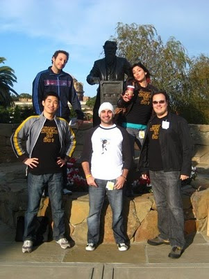
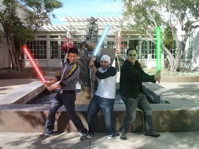
Yesterday was the last session of the first Spungella-On-Site Workshop and I wanted to thank every animator who was part of it! Those Tuesday evening were a blast and I had a really fun time every week. You guys are an awesome group and very very talented on so many levels (the 100 frame shots that you guys did were so cool and once everybody is happy with their work I'll post them here for people to see). To finish this off, here a few pictures from their visit at work.


Monday, December 14, 2009
Skywalker Ranch (NAR)
Skywalker Ranch from Philip Bloom on Vimeo.
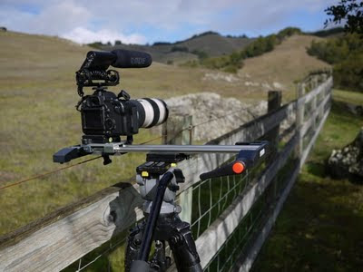
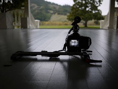
Despite the N-on A-animation R-elated nature I wanted to post this awesome clip of Skywalker Ranch shot using Canon DSLRs.
Head over to philipbloom.co.uk for the whole story about this shoot.
If you ever have a chance to go up there I highly recommend it. It's so quiet and beautiful, I love to visit Ranch.
Sunday, December 13, 2009
Weight
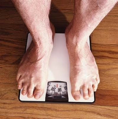
I just answered an email question about how to fix weight issues and I thought I might as well post the answer here.
About the weight. ... [there's] not a trick per se to fix it, but you can pay attention to the translation specifically. Any movement that's going up/down or sideways has to have a slow part going into something faster or vice versa.
If you have even timing and even movement it will look robotic and/or floaty.
If someone goes up, then he/she/it has to activate the muscles and fight gravity, so the up movement will be slow at the beginning, but increase over time.
Same during a down movement. The down movement of the character will start slowly and increase as it goes down since gravity comes into play.
For sideways movement think of how the character is moving and where it is going. If the character is just standing there facing you and taking a sidestep screen left for instance, then the screen right leg is doing the pushing. So those muscles have to fire up first and then the character can push off in order to move. The spacing will start close together and get wider over time.
If a character is moving fast or jumping in one direction and is then doing a direction change you have to think about how the body has to deal with the momentum.
Now, depending on the style, those ease ins/outs can happen over ten or more frames or over one or two. I'm just talking about the general idea or principle. Always be aware of the style (and to a point also the physical nature of the character (ant vs. elephant for instance).
Hope this helps!
Cheers
JD
pic source
Friday, December 11, 2009
Run for the Artifact
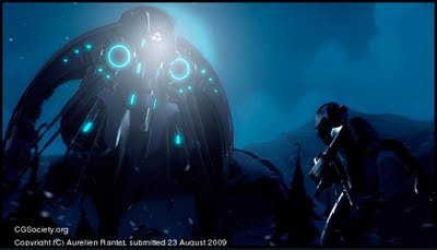
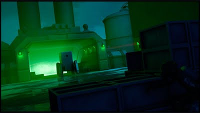
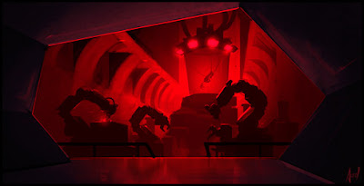
Head over to cgsociety and watch Run for the Artifact. The animation might need some more work, but there are some cool ideas and designs in it. The site is nicely detailed as well, with making-ofs and other informational tidbits. Thanks Omer for the tip!
The Gloomers
Rachel Rhee asked me to check out The Gloomers and you can as well! There's a holiday episode featuring tech/web celebrity Veronica Belmont (@veronica).
A little back story on the Gloomers team:
A little back story on the Gloomers team:
The Gloomers is an animated, family-centric cartoon series that launched at Comic Con in 2009, and is a reinvention of Hanna Barbera style and content. Gloomers Chairman, Charles Mechem, was CEO of the company that owned Hanna Barbera from 1967 until 1990. Neal Barbera, Joe Barbera’s son, is a senior writer for The Gloomers, and previously penned scripts for Scooby Doo, Yogi Bear and many other memorable HB shows. More information is available at www.facebook.com/thegloomers.
Thursday, December 10, 2009
Madame Tutli-Putli
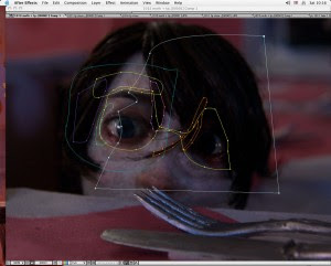
[update] Thanks Stefan for the link! Click here to see how the eyes were done.
Word is that the eyes were real and composited into it? Anybody know? Did they use Winona Ryder for reference? :)
New Site: Speaking of Animation
 Check out the new site Speaking of Animation by Jacob Gardner and his friends! Looking very cool already and there's a podcast with Dreamworks Animator Ted Ty! (thanks for the tip Jacob!)
Wednesday, December 9, 2009
AM Tips and Tricks blog: What makes a good and honest animator
Check out the latest post by David Breaux over at animationtipsandtricks.com
Great advise on how to grow as an animator:
Head over there to read the whole thing!
Great advise on how to grow as an animator:
Strive to do your best work, and remember it isn't your show/game. You are providing a service. If a director wants something, and you think it’s a bad decision or a problem, make it known to your supervisor or animation director, but don't fight it. If they elect to follow your opinion great, you’re a hero for pointing it out. If not don't latch on like a pit bull, leave it at that and do the best you can given the constraints. I think that makes a good honest animator: you are showing that you recognize issues, care about your work, and confront them head on, but are still a team player.
Head over there to read the whole thing!
Tuesday, December 8, 2009
French Roast
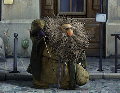
Go and watch French Roast by Fabrice O. Joubert! Sweet design and animation! (Thanks Ting for the tip!)
Friday, December 4, 2009
New Workshop Dates and Schedules
Head over to Spungella On-Site for all the information regarding start/end dates. In short, first 2010 workshop starts February 2nd, the second one starts March 25th. 16 sessions as always.
Cheers
Jean-Denis
Cheers
Jean-Denis
Critique - jump, fire, collapse
My 2 cents:
- I wouldn't add that camera move at the beginning of the last shot. It
happens right at the beginning of the shot and gets lost because it's
over so quickly. Either take it out or add a slower version of it. No
dealbreaker though.
- The dart seems odd. When you step frame through it you have a very
blurred frame pointing down, the a slightly less blurred one, then the
hit with no blur. And the spacing gets smaller as it approaches the arm.
Something a bit off. No dealbreaker except that blurry pointing down
first frame.
- anim wise the biggest thing to me is the guy's pose and expression in
the last shot. He feels a bit curious, surprised, but that's it. For
someone who's on the run I miss an intensity and urgency and even slight
panic.
Looking good!!
For more work of this animator, check out www.azizk.com
AAU Animation Festival guest speaker Nik Ranieri from Disney
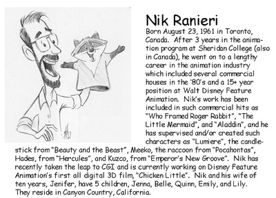
David Nethery sent me a reminder that Disney supervising animator Nik Ranieri will be at the annual AAU School of Animation Fall Animation Festival today (sorry for the late notice!!) Head over to David's blog for more details.
Thursday, December 3, 2009
The Passenger by Chris Jones
Completed in 2006, The Passenger was created in its entirety by Chris Jones over an eight year period. Find out how and why at: http://www.chrisj.com.au . Note: this is a low res, monophonic, compression drenched, generally fairly appalling version - for an idea of the DVD quality, download the hi-res trailer at www.chrisj.com.au/thepassenger
Very cool!! Make sure to check out the main site and the making-of!
Tuesday, December 1, 2009
2009 Annie Award Nominees
Full list at Cartoon Brew:
Character Animation in a Television Production
Kevan Shorey “Merry Madagascar” – DreamWorks Animation
Mark Donald “B.O.B.’s Big Break” – DreamWorks Animation
Mark Mitchell “Prep and Landing” – Walt Disney Animation Studio
Phillip To “Monsters vs. Aliens: Mutant Pumpkins from Outer Space” – DreamWorks Animation
Tony Smeed “Prep and Landing” – Walt Disney Animation Studios
Character Animation in a Feature Production
Andreas Deja “The Princess and the Frog” – Walt Disney Animation Studios
Eric Goldberg “The Princess and the Frog” – Walt Disney Animation Studios
Travis Knight “Coraline” – Laika
Daniel Nguyen “Up” – Pixar Animation Studios
Bruce Smith “The Princess and the Frog” – Walt Disney Animation Studios
Monday, November 30, 2009
Catching up on anim news
I'm sure it's old news for most people, but here a few things that I thought were cool!
- Lego Matrix Stop-Motion (thanks Omer!)
- Pixar Short: George and AJ (thanks again Omer!)
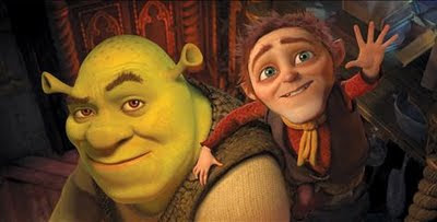
- first look at Shrek Forever After, which is the final Shrek movie?
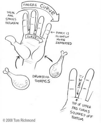
- Drawing Hands is a very cool post @ tomrichmond.com and it's, as the title says, about drawing hands and the structure of hands
- the list of the ten animated shorts competing for an Oscar are out @ Animated-Views
- Avatar making-ofs and James Cameron interviews, plus a sneak peak at James Horner's score for the movie and a closer look at Colonel Quaritch (spoilers beware for all of those)
- Lego Matrix Stop-Motion (thanks Omer!)
- Pixar Short: George and AJ (thanks again Omer!)
- first look at Shrek Forever After, which is the final Shrek movie?

- Drawing Hands is a very cool post @ tomrichmond.com and it's, as the title says, about drawing hands and the structure of hands

- the list of the ten animated shorts competing for an Oscar are out @ Animated-Views
- Avatar making-ofs and James Cameron interviews, plus a sneak peak at James Horner's score for the movie and a closer look at Colonel Quaritch (spoilers beware for all of those)
Back from vacation!
Sorry for the lack of posts. I've enjoyed two weeks off with my family and friends in Switzerland. Now back to business!!
And Bernie! Stop posting fake anim rip-off clips!! (even though that one was awesome!).
- pic source
Sunday, November 22, 2009
UPDATE! Don't copy other people's work.
(UPDATE!) Looks like we have another winner (or loser, depending on your point of view)!
Here you can watch my original: Battery Bunny
Here you can watch my original: Battery Bunny
__________________________________________
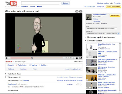
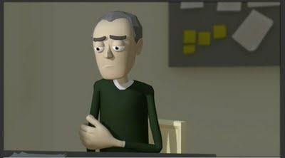


Someone (thanks you-know-who-you-are) sent me a tip that another animator decided to copy one of my animation clips.
I guess I should be flattered, but it should be pretty clear to anyone to NOT copy other people's work. My clip is from 2005 (the copy is from 2008) and I won't use it on a reel anymore, so the impact of the person stealing my clip is very minimal.
But still. It's pretty much a 1-to-1 copy. The funny thing is, the animator even used my sound clip. I took a longer section and re-edited to make it shorter and that's what the animator used as well.
Please make an effort to be original Aysha Khan.
Tuesday, November 17, 2009
Nerd Alert: Pixar's "Up" Soundtrack and Sound Design
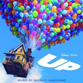
I got the fantastic score by Michael Giacchino for Up and the last three tracks feature the sound design by Skywalker Sound: Carl's Maiden Voyage, Muntz's Dark Reverie and Meet Kevin In The Jungle. Here an article about the sound work @ designingsound.com
"UP" Sound for Film Profile from Michael Coleman on Vimeo.
(Was that clip on the Up Blu-ray/DVD? - Great to hear the sound of Kevin only. At 2:41, when Kevin hits Carl, his voice is heard and distorted through the beak of the bird, awesome!)
To have those three tracks is very nerdy and a welcome surprise. I know, most people won't care, but if I had to choose something else than animation, then it would be sound design. Remember back in the day when you could listen to the sound design track on Pixar movies? I think A Bug's Life was the last DVD that had this feature. Anyone know? I remember missing it on Finding Nemo for sure. Aahhh... the good old days. :)
J.J.'s Star Trek out on Blu-ray and DVD!
Continuing with more product news, J. J. Abrams' Star Trek reboot is out on Bluray: Star Trek (Three-Disc +Digital Copy) [Blu-ray]
and DVD: Star Trek (Two-Disc Digital Copy Edition) .
.
Being a big Star Trek nerd I wasn't too sure what to expect given the casting, but once I saw the first footage of Kirk at work I was sold. It was already funny back then and the finished film definitely won me over. For once a movie I'm really proud of (not just FX wise but as a whole) and I highly recommend it, even to non-Trekkies/Trekkers, it's just a lot of fun. Oh, and guess what? $20 for three disc, a digital copy and TONS of bonus material. I wonder how much the movie-only version will cost on iTunes.... probably... $20!!!!!!!!! :)
and DVD: Star Trek (Two-Disc Digital Copy Edition)
Being a big Star Trek nerd I wasn't too sure what to expect given the casting, but once I saw the first footage of Kirk at work I was sold. It was already funny back then and the finished film definitely won me over. For once a movie I'm really proud of (not just FX wise but as a whole) and I highly recommend it, even to non-Trekkies/Trekkers, it's just a lot of fun. Oh, and guess what? $20 for three disc, a digital copy and TONS of bonus material. I wonder how much the movie-only version will cost on iTunes.... probably... $20!!!!!!!!! :)
Thursday, November 12, 2009
Pixar's "Up" out on Blu-ray and DVD
Amazon has a great deal for the newest Pixar movie: $19.99 for Up (4 Disc Combo Pack with Digital Copy and DVD),
What's still really confusing to me is the price structure of digital downloads. If you look at the Amazon deal: for $20 you get all of this (according to highdefdigest.com):
Technical Specs
* 4-Disc Set
* BD/DVD Combo
* Digital Copy
Video Resolution/Codec
* 1080p/AVC MPEG-4
Aspect Ratio(s)
* 1.78:1
Audio Formats
* English DTS-HD Master Audio 5.1 Surround Sound
* French Dolby Digital 5.1
* Spanish Dolby Digital 5.1
* English DTS-HD 2.0
* English Descriptive Video Service 2.0
Subtitles/Captions
* English for the hearing impaired
* French
* Spanish
Supplements
* Cinexplore with Pete Docter and Bob Peterson
* Adventure is Out There!
* Dug's Special Mission
* Documentaries
* The Many Endings of Muntz
* DVD of film
* Digital Copy
* The Egg
* Russell: Wilderness Explorer
* Geriatric Hero
* Canine Companions
* Alternate Scene: Married Life
* Homemakers of Pixar
* Our Giant, Flightless Friend Kevin
* Balloons and Flight
* Composing for Characters
* Worldwide Trailers
* Up Promo Montage
* Global Guardian Board Game
* Partly Cloudy animated short
* Theatrical trailer #2
* Theatrical trailer #3
That's A LOT of good stuff for a really good price.
Now compare this to iTunes' content if you buy it there:
Dolby Digital 5.1 in English
That's it? And you should pay $15 for that?? It's not even HD. If you want HD you have to pay $20. The same price as the Blu-ray deal? Really???
If you get the iTunes Extra version (according iTunes and Upcomingpixar.com) you have:
- the movie
- two shorts, one of them not found on the Blu-ray nor DVD called George & A.J.
- alternate scenes
- 6 Disney Printables + Much More!
So in order to be able to watch all the possible special features and shorts you have to buy the movie TWICE?? And what is "Much More!"? iTunes Extra stuff is only viewable using iTunes or an Apple TV. So unless I own an Apple TV or have a PC/Mac hooked up to my TV or Projector, I can't watch it on a big screen. So all in all the iTunes deal is horrible. Especially compared to Blu-ray or DVD offer which gives you much more AND the digital copy. They should offer special features as a separate deal, charge $99 or more for it, depending on what it is.
Of course I'd be the first one saying "No one FORCES you to buy ANYTHING! Take it or leave it." Sure. But come on.
Aaaaanway, had to get that off my chest.
Wednesday, November 11, 2009
Critique - That's so cool!
First thing that I haven't and should have mentioned (unless it's new). The screen right arm holding the joypad swinging down on x172 to 176 is super fast. Add at least two frames to it (he's more letting it drop as opposed to this fast push/move down), don't have it stop so sharply (it's resting on a comfy couch, so it's going to be soft), and add more of an arc to it, it's fairly straight in it's arc right now.
The chop movement should still be faster, don't be affraid to push it!
The end head move is better ("That is so cool!"), but I would push it more as well. What could help is this: on x171 he's about to rest the back and the head on the couch. In order to get rid of that stiff feeling, just rotate the lower neck back clockwise and the head counterclockwise forward, so it feels like the head is pushing against the couch and bending because of it. Right now he falls back and feels rigid throughout. By doing that head change you would push the overall C curve of the body.
That's just a suggestion. You can also move the head more screen right so it falls back more. It would just love to see something more complex movement wise as he falls back.
Hope that helps!
Cheers
JD
- to see more of Louaye's work, go to http://www.Louaye.com
Tuesday, November 10, 2009
Cannery Rodent
One of my childhood favorites, LOVE the music every time the shark shows up and the awesome snap at 4:44 (and you can see how that stayed with me when you watch the "fisher" clip :) ).
Gene Deitch: Quo Vadis Animation?
Here's a GREAT view on the current state of animation by Gene Deitch. Go to Cartoon Brew for the whole context and story as well as a clip of Gene Deitch himself, but I'm going to shamelessly copy/paste the transcript here as well, because it's so good:
Animation has come a long way since I was a boy. I was raised in Hollywood and fell in love with movie cartoons at a very early age. In those days - the early 1930s - going to the movies was a giant experience. For one admission ticket -25 to 35 cents for an adult - just ten cents for me - we could see two complete feature films, which in those days were not more than an hour-and-a-half long, a newsreel, a travelogue, an adventure serial, perhaps a comedy “Short Subject,” and a cartoon - sometimes two cartoons.
For me, the cartoon was the best part, but for the movie theater owners it was just another time filler that limited the number of shows he could schedule per day. To earn their place on the program the cartoons had to be wildly funny, and they quickly became formula productions. In Europe they were called “grotesques,” and there was no attempt to imitate reality.
The arrival of television changed all that. With nightly news for the growing mass TV audience, there was no further need for newsreels. Then came all sorts of soap operas, dramas, documentaries, comedy shows, travel features, sports, and of course cartoons galore. Why go to the movies when you had all that at home?
And why should theater owners pay for short subjects when all the people wanted to see was the feature? So soon enough, all we got for the higher price we paid for a movie ticket was one feature film, some advertising and lots of previews of more movies.
It was the visionary Walt Disney, who all the way back to the 1930s saw that cartoon shorts were doomed. He had the impossible dream of making the cartoon become the main feature attraction. To do that he believed that he had to somehow make drawn animation look more realistic. As a 13-year-old kid, I attended the premiere run of Snow White & The Seven Dwarfs at the Hollywood Pantages Theater, I witnessed the first example of a historic change-of-course for film animation. Disney felt that cartoon simplicity could not sustain a feature-length movie. So Snow White contained the dramatic lighting effects, the shadowing, the rounded shading of characters, and the amazing MultiPlane camera depth effects - the first steps toward making animated movies become more and more realistic.
Once began, this became the dominating goal of animation: to become as close to a live action movie as possible. By today, with the development of computers and amazing digital procedures, computer generated animation, motion capture, and stereoscopic 3D. We’re almost there; the perfect imitation of reality with animation. Is this a success? Or is it the end of a blind alley? What next?
As it happened, I began my career in animation at a studio that pioneered the opposite course. “Why should animation, potentially the greatest of all existing art forms, incorporating and blending all of them, limit itself by trying to imitate what a camera does? It was UPA, United Productions of America.
A glorious name for a tiny studio founded on a simple but revolutionary idea: that the whole world of graphic art was open to animation - animation bringing magic and storytelling in every visual style, with no attempt to imitate what the camera will always do better.
I am here to raise a cheer for what I prefer to call Drawn Animation. We who have been raised on the tradition of animated drawings, attempting create what Frank Thomas and Ollie Johnston called, “The Illusion of Life,” have been more and more pushed aside and given the demeaning title of “2D” animators. I am quick to remind you that anything projected onto a flat movie screen is essentially 2D. It’s a meaningless term. I repeat that the entire world of graphic art, every drawn or painted style can be animated in any fanciful way, which in turn would lead to the widest range of storytelling and endless visual variety.
Whereas so-called 3D animation, with its amazing refinement, technical dazzle, and natural-looking realism, is becoming more and more alike. Drawing and painting goes back to the beginnings of humanity, and is still a limitless means of expression. It certainly should not be pushed aside in the world of cinema animation!
Of course, I know that there is another branch of animation; Special Effects for essentially live-action movies. That kind of animation - recreation of dinosaurs or entire cities being blown up, and stunt performers saved from injury with the substitution of animated dummies….is hyper reality that I greatly admire and respect. It MUST be extremely realistic and visually convincing! Amazing special effects animation is now so seamlessly blended into live action movies, that we accept it as real. Such movies do not claim or pretend to be animation features.
As a 48 year member of the Hollywood Academy of Motion Picture Arts & Sciences, I am one of the people who vote each year for the awards known as Oscars. In my own category of Animation, it becomes harder and harder to distinguish whether a film is in fact basically an animation or live-action movie. Today, every film contains at least some elements of both. Historically and technically, cinema animation involves the creating and manipulating still images that when projected onto the screen in very rapid sequence - faster than the human retention of vision - gives the illusion of motion. So human acting in front of a camera is by that definition not animation. Yet the technology of digital motion capture can be used to convert human acting - pantomime - into designed creatures, which does look very much like animation. So to many people - most people in a cinema audience, if it looks like animation it must be animation!
I’ve given up trying to argue the point, but still have difficulty in voting for a movie in the Animation category which I know to be actually a digitalized manipulation of human acting. and not the illusion of motion created in series of still images. So what? It must soon come down to eliminating a separate Animation category, and allow us to vote for any movie on the basis of the story it tells and how skillfully and artfully it tells it, regardless of the mix of technologies used in its production.
It is in fact getting harder and harder to find a clear definition of what is an animated film, and what is a live action. film! What was The Lord of The Rings, which so deftly combined animation into an essentially live action film? What are the Harry Potter films, including so many animation effects? And now we have the technology called “Motion Capture.” Which does claim to be form of animation. How do we classify Motion Capture -”Mo-Cap?” Many movies today combine all of these elements. How do we classify them? Today, nearly every film is a combination of live-action, special effects and some form of animation. When we see drawings, we’re pretty sure we are seeing animation!
There must be room for the art of drawing and painting to hold onto it’s role in storytelling and the stimulation of imagination. Graphic art and design has a great influence on all of our lives, and we really cannot live a full life without it!
In my on-line book, How To Succeed in Animation I make the claim that animation is potentially the greatest of all art forms, as it combines nearly all of the others. Drawing, painting, music, story telling, literature, acting, theater, singing, dancing.. you name it; all can be incorporated into this miraculous art form do cinema animation! The word animation itself means, “The breath of life.” Why should this potentially powerful medium be limited to literal realism, when the endless possibilities of magic realism are open to it?
I feel this is an important topic for discussion, and I would like to hear your thoughts about it. I welcome your questions and ideas.
Monday, November 9, 2009
Basic Staging Principles (part 1) by Mark Kennedy
Temple of the Seven Golden Camels is a great site and the current post is great as always. It talks about Staging Principles and how you should approach your shot using various compositional tricks.
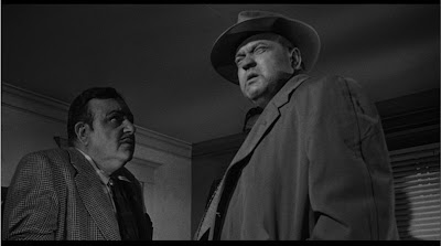
In "Touch of Evil", the camera frequently shoots Orson Welles from below to make him look not only threatening and powerful (which he is) but also to emphasize his obesity which is a symbol of his inner corruption (in my interpretation, anyway).

Paperwalker
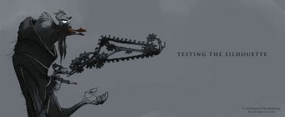
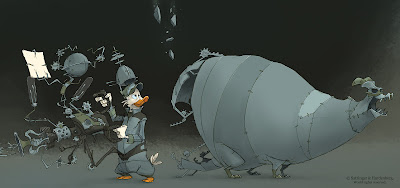
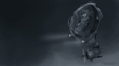
I was going through some emails at work and found an unread one with a link to Paperwalker by Florian Satzinger. I totally forgot about it, but I really like the drawings on that site, go check it out!
Thursday, November 5, 2009
Anim Clip - Shark
________________________________________________________
Latest of my spare time animation clips. I'm having progressively more fun doing that stuff, it's really freeing to do your own animation at home. It's really all about practice practice practice. Workflow wise still neglecting the GE, but after roughing out the layout and camera, there was a lot of straight ahead animation going on. I wasn't too married on length and re-edited as I went along, enjoying the freedom of animation without length-specific live-action plates. :)
Definitely got different versions per shot, but same as the Paintball one, I just wanted to plow ahead and finish it (as opposed to all my other stuff I never finish), so I'll post the progression playblasts later. It's time to catch up on sleep. It's tricky to balance family with work and spare time anim but you do get a lot done when you sleep a bit less. Just relax every now and then and eat healthy and exercise in order to keep some sort of balance. :)
Shot details:
Not too sure how long it took me animation wise specifically for this project since I did the paintball clips at the same time (I like going back and forth between shots, it helps keeping a fresh eye), but if I add up the hours throughout the week and week-ends, I would say the "Looks clear", Paintball and this project all together took about a full week (Mo-Su) at typical production length days (so 9-10 hours), which I'm pretty happy with. Add another day for rendering, compositing layers, building sets & rigs, etc.
- Rigs: Norman, Octomall, Shark, Fish is a combination of this fish with those eyes :)
- Set is all basis Maya stuff
Anim Clip - Paintball
________________________________________________________
Here the shot details:
Rigs: Fuzzy, with the helmet of Travis
Set pieces are a combination of free assets on Turbosquid
Wednesday, November 4, 2009
Prep and Landing - Official Trailer - Walt Disney Animation Studios
That looks really cute, I totally want to see that! Thanks Omer for the tip!
UPDATE: Here some more hires stuff plus behind the scenes:
Monday, November 2, 2009
Saturday, October 31, 2009
Critique - Date
Hey,
that's looks really good!
The girl especially, nice job!! I love how she puts the menu down, how the hand touches the table then how she slides out her fingers under it and how the menu drops. VERY COOL!
My suggestion would be to work a tiny bit more on how she picks up the glass. The lift is a bit too slow at the beginning, and I'm talking the first 7 frames or so, and if you look closely the fingers slide up the glass during that section. The combination of that makes the grab a bit off.
Love how she swings the glass around, that little twirle, good stuff!
I think she goes into her "OO" shape a bit quickly, the one around x350, you could soften that a tiny bit and have it happen later, right before she gets the glass on her lips. Then the lip contact with the glass needs be stronger, right now it feels a bit swimmy. You don't buy it that the glass is resting on her lips.
Is her hair going up because she puffs air out of her mouth? I'd also color the hair brown. It's the only piece that moves and since it's a separate color, it's as if you want to say "Look! That one is going to move!".
The guy needs also a bit of work when he picks up the glass.
Add more time when he drinks, right now he barely touches the glass and he puts it down again. Just a few more frames of contact.
I like how the glass is not flat as he puts it down, it's slightly rotated, good!
I would drop the ring at a much lower height, just above the glass. Right now it's really drawing attention to it. But I like the wine drop. :)
The hand he's holding up feels a bit swimmy and IK-ish from x304 to 322, especially towards the end of that range, where the hand goes up but the wrist rotates down.
Keep his right hand a bit longer towards him on x401, so that the arm is not just going up and then out, give it a little pause.
Sweet, keep going!
Cheers
JD
Thursday, October 29, 2009
I'm rarely using the graph editor.
Crazy, right?
I used to love to go in there and tweak the curves until it was beautiful spaghetti heaven. But now, I almost forget about it. As I'm working on my own clips (I'll post some more this week-end and next week) I've been paying attention to what I'm doing, especially ever since I get asked by students and workshop attendees what my workflow is. And I realized that I don't use it as much anymore. In fact, for the current clip I'm working on I check my curves for moving holds and in case there are some hiccups that just won't go away due to some funky spline curve bumps, but that's it.
I love to work through the viewport with hotkeys for making my character CONs visible, I go frame by frame, draw and plot arcs using my dry erase pen or intense staring :), and check every now and then in my perspective view that my character works in 3D space. When I need to copy/paste keys, insert breakdowns, space out keys, convert from linear to spline (I block everything out using linear curves), etc. I use the Maya timeline for it.
The only time I go back and tweak my curves is when my character rig is light, so I can play the animation in real-time and adjust the curves as I'm watching it in order to get the right feel and timing that I want. But since I can't really remember the last time I used a light rig, it's an exception. Although Norman is very light and it would work with that rig.
Although yesterday I had to tweak a foot roll so that my leg would not over-extend during a hold and that required super small value changes, which I only got through the graph editor. So I guess for detail work like that I go back to it.
But by now I'm just so used to working by setting additional keys instead of tweaking curves, that I don't miss the graph editor. I don't have thousands of keys though, I'm still pretty organized and clean most of the time. I can't say that I'm a slow animator either (I think), so I don't think there would be a workflow speed improvement. It's still shocking though to me. Managing curves and splines or whatever you want to call it is always regarded as a holy grail, some people even have barely any keys and do everything through curves. I guess everybody has their own way.
What do you guys use? What's your method? Anybody else out there who almost abandoned the graph editor?
New SOS Workshop Signup Procedure - First Come First Served at all times
... and you can attend multiple workshops in a row. No sign-up date anymore. If you're interested in attending, please use signup@spungella(dot) at any time. For more information, go to spungellaonsite. Thanks!
Cheers
Jean-Denis
Cheers
Jean-Denis
Wednesday, October 28, 2009
Sergio Pablos rough animation of Doppler
Think what you want about the movie, but the animation is great!
Sergio Pablos rough animation of Doppler from Haylee Herrick on Vimeo.
Monday, October 26, 2009
C BLOCK film
Love it! (thanks Bernie for the Tip!)
From the youtube info:
C Block is a short animated student film directed by Vladimir Kooperman at Sheridan College. Blog: tallrussian.blogspot.com Enjoy!
From the youtube info:
C Block is a short animated student film directed by Vladimir Kooperman at Sheridan College. Blog: tallrussian.blogspot.com Enjoy!
Friday, October 23, 2009
Skhizein - Genius short
All I can is AWESOME! Love the idea, love the look, love the music, love the voices, love it, love it, love it! This would make for a fantastic feature. (thanks Eric for the tip!!)
Wednesday, October 21, 2009
Brendan's Bouncing Ball Lecture
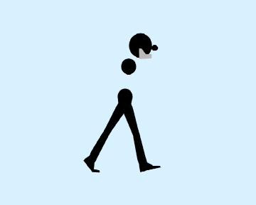
Brendan Body put up an AWESOME tutorial and deconstruction of a bouncing ball. Don't be fooled by the "basic" animation idea, because he nicely demonstrates how a bouncing ball principle can be applied to a walk (human, squirrel or dinosaur). Go check it out! (thanks Brecht for the tip!!)
Saturday, October 17, 2009
SOS Workshop #2 Details
The 2nd workshop is starting October 29th, 2009 on a weekly basis for a total of 16 sessions. It's every Thursday, 7pm to 10pm, same location as the first workshop.
There will be a two week break at the end of November and another break during Christmas for the holidays of course.
As always, if you have questions, consult the F.A.Q. and if you still have questions, just email me.
There will be a two week break at the end of November and another break during Christmas for the holidays of course.
As always, if you have questions, consult the F.A.Q. and if you still have questions, just email me.
Variations on a theme
valleydweller linked to a great clip for #animtip Tuesday. Imagine that was an assignment. To come up with multiple ways of entering a room while opening a door. :)
I like how halfway through the clip he starts to find a specific way.
I like how halfway through the clip he starts to find a specific way.
Thursday, October 15, 2009
Le phare
Awesome short (Gobelins rules!). I love the atmosphere of it, the score is great! (thanks Saul for the tip!)
Tuesday, October 13, 2009
Elemental Magic: The Art of Special Effects Animation
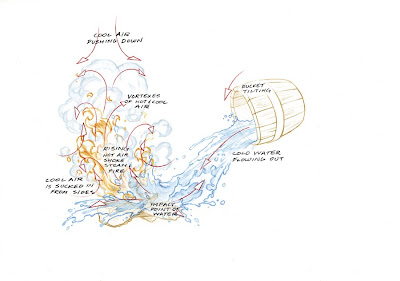 I haven't seen it yet, but from the looks of it so far Elemental Magic: The Art of Special Effects Animation
Maybe one day we will have easy cloth and hair control on rigs.
Now, I can't comment on what other companies are using and I'm not talking about our rigs at work. I'm just dreaming of a super simple setup for cloth and hair, so you can "easily" do something like this:
Wouldn't that be a nightmare right now? You might tell the sim what to do on a broad scale, but you can't really animate, shape and tweak their clothes, hair, the napkin, the pillow and the blanket as easily as posing out your rig. Or can you?
Wouldn't that be a nightmare right now? You might tell the sim what to do on a broad scale, but you can't really animate, shape and tweak their clothes, hair, the napkin, the pillow and the blanket as easily as posing out your rig. Or can you?
Monday, October 12, 2009
The Runner - by Richard Spriggs
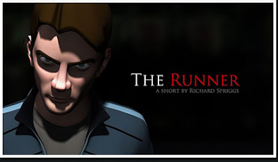
Neat video with making-of (thanks Omer!). Watch the clip here and find out more about the project here.
Sunday, October 11, 2009
Cloudy with a Chance of Meatballs - Reel by David Gibson
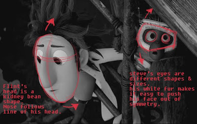
David Gibson does it again! Check out his reel and his explanations to how he approached his shots. Thanks for sharing!
Cloudy with a Chance of Meatballs - Awesome movie
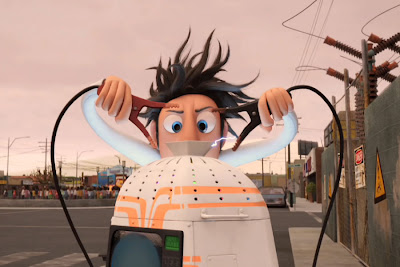
Just like with Panda I wasn't too intrigued once I saw the first promotional image, but just like with Panda I was proven very wrong. I try to be all mature and judge a movie AFTER I've seen it but sometimes it's difficult not to be judgmental early on. But anyway, I really really liked the movie. Funny story, awesome animation, great designs, great look, great voices (the dad was awesome), not heavy on pop-culture references or contemporary comparisons, etc. etc.
All in all, awesome.
The 3D not so much. Must be my eyes, plus glasses on top of glasses is not ideal for me either. At the beginning it's stroby and eye-straining, and the colors are so muted. Still cool effect, but not essential to the movie (at least for me). Once you can enjoy it without glasses, I'm all for it.
Congratulations Sony, very well done! Can't wait to see more!
- pic source
Subscribe to:
Comments (Atom)


