Thursday, July 30, 2009

Leading the audience's eye

For those of you who are working on a short or who are working on a sequence, make sure that when you go from shot to shot that the composition of your characters works over the cut. You don't want to confuse the audience. By that I mean the following:

Looking at the Toy Story 3 teaser you can see how thought out the placement of the characters is over the cut. One of the shots is this one:


The soldier is talking to Woody. Looking up, so we expect Woody to be around here in the next shot:


... at least roughly. It would be really weird for Woody to be on the far right, so that the audience has to look around until they find him:

(altered picture)

... unless there is an important reason for that (still a bit jarring though).

In the trailer the next shot has Woody here:


And how acurate and well placed is he? Well, let's put both shots together:

Look at that!

And stuff like that is even present in crazy frantic sequences like the car chase in Bourne Supremacy. Last year I saw a presentation about that and it's really cool to see once you know where to look and what to look out for.

Cheers
JD

______________________________________________________
Images Copyright Disney / Pixar. All Rights Reserved

Sweet Posable Figures


Look at those super sweet posable figures!!! Unfortunately the pre-order is already over. Would love to do a stop-motion cycle with those.

I found those via GoNintendo, which led me to Tokyo Hunter, which led me to this one:

Sweet pose!

That Tokyo Hunter site has some crazy figures, but if anybody knows how to get Rockman and or Samus, let me know!!!

The Fantastic Mr. Fox - Trailer

Monday, July 27, 2009

Acting Reference - Miracle at St. Anna


Here's a moment I liked in the movie Miracle at St. Anna. The reporter seen here is scratching or wiping his face in an interesting way. I like those casual moves you can put in your shot. I love it when they are coming out of the blue, like Syndrome shaking his arm/hand as he walks in The Incredibles. The tricky thing is to not make them look forced. The mouth movements are good too, especially at the end. You don't have to limit your facial acting to the audio clip and keep the face default or in one pose during silent moments.

Now don't start to add random things in your acting, but don't disregard them either if those moments happen as you act out a scene.

_______________________________________
Video clip is for educational purposes only

Copyright © MMVIII Touchstone Pictures

All Rights Reserved.

How to keep your eyes fresh

It's easy to get lost in your shot and focus on details, then you show it to someone who's never seen it before and they see mistakes that are super obvious.

One thing you can do while watching your shot is to mirror it (check comments on how to do that in quicktime, thanks Rico!). You'll be surprised to see how much of a difference it makes.

Why do I post this? I was reading news on James Cameron's Avatar on Dark Horizons and it looks like he does the same trick to keep his eyes fresh:

I think something happens to filmmakers, which is that they watch their own action sequences so many times that they actually learn where the next image – where the subject coming in in the next image is. So they’re already looking there. But the audience doesn't do that. So, I actually watch all my action sequences bilaterally transposed. Flopped. When I get it all cut the way I think it’s supposed to work, I’ll watch it backwards. I don’t mean backwards in temporal order, I mean in a mirror, right? I’ll watch a movie in a mirror.

So my instinct to look where the next thing’s happening gets short-circuited. It’s actually – you realize how dependent you’ve become on your own watching process. But it goes back to that thing I was talking about before, which is – you’ve got to be able to watch your own stuff with fresh eyes, to anticipate the audience’s reaction. I think it’s an art, and I think it’s a discipline.


Of course why wouldn't he do the same, but it's always fun to know what pros are doing.

Wednesday, July 22, 2009

AM Demo Reel by Justin Henton

[update] David Alvarez (thanks!) pointed to Justin's second clip, which to me is even more awesome!! Check it out @ http://blog.jchenton.com/animation/

Here's a really cool Animation Mentor demo reel by Justin Henton (thanks Ting for the tip!!), where all the clips have a common theme instead of being just separate pieces. Very nice!

11secondclub Winner BJ Crawford

Head over to the 11secondclub and check out the latest winner's clip! BJ Crawford did an amazing job and make sure to watch Jon Collin's eCritique as well!

Simon's Sister's Dog 'Fed Up'

So awesome!!

Monday, July 20, 2009

Spungella On-Site F.A.Q. is up!

Go to spungellaonsite.blogspot.com for questions and answers. If you have more questions, let me know!

Spungella On-Site Email Instructions for Sign-Up - Update

_________________________________________________________________________

[update:]

Well, this is very weird, looks like people got error messages, but I got all of your emails on that account. Maybe my host had a hiccup and sent out that error? But since so many had problems, what if some didn't go through?

I'm really sorry for that, no idea what happened. I changed the email and tested it, and just like the other one, it works.

In order to keep it fair for everybody, I will cancel this sign-up and re-open it for tomorrow, 12:30pm. Feel free to email me on the new address as a test today.
_________________________________________________________________________


I you plan on emailing me about SOS, then here are the details:


Send an email to: signup (at) spungella.com

Subject: Fall 2009 SOS Workshop sign-up

Body: I'd like to attend the 2009 Fall SOS workshop (or something like that).

Sign-up time is 7/21/09, 12:30pm, San Francisco time.

- pic source

Thursday, July 16, 2009

The Queen is dead. Long Live the Queen. - repost

For the frequent readers: yes, this is a repost. I deleted this post a few days into it in order to revisit the content. So here we go again. Updates in red.

I just had to write that title for the subject. I watched Elizabeth over the week-end [which is now a few week-ends ago] and I really liked it. Can't wait to watch Elizabeth: The Golden Age. Great performances!

But the more appropriate title for this post would be: The Classes are dead. Long Live the Classes!

That's right, there will be more animation rants, but in a slightly different way. Nothing has been finalized yet [pretty close though], but the current plan is to use a conference room downtown, courtesy of The Resource Corner, LLC, at One Sutter Street, two or three blocks away from the 79 buidling, close to BART, Muni, etc.

The specifics so far are:

  • 16 sessions in Spring & Fall (one session per week)
  • 16 sessions in Summer (two sessions per week)
  • 7 to 10pm
  • 12 animators
  • $740 total per animator (paid in full prior to workshop start)

The course model will be the same I used at the Academy. You can bring in any clip for review during the session and email me during the week for further feedback. Clips can be anything ranging from bouncing balls to short films. You can come in to start with the basics or to do a demo reel review, that's all up to you.

There won't be any grades, no homework, etc. so no "midterm" and "finals" and I won't "fail" you. It's a workshop environment with reviews as well as lectures and spungella.com will serve as an extension to the on-site sessions. If you've attended any of my classes, then you know the drill. I'm here to help, but be ready to get honest (albeit subjective) feedback.

The current start date for this Fall workshop is September 1st and will last until December 15th. The start date is pretty fix, but the end date might change a tiny bit depending on what day class starts. Right now I'm shooting for Tuesday evenings.

Again, I'm still ironing out all the details, but that's the basic idea for now. Once everything is laid out I will post an official announcements [this Monday] with all the gory details and an FAQ.

Sign-up will be on a first come first serve basis via email request on Monday, July 20th 2009, 1pm.

I'd love to get some feedback about all this in the comments section though [which I got already last time (thanks!!), but feel free to add more]. Any questions, ideas, suggestions, I'm open to whatever I can do (within reason) to make this as awesome as it can be.

I'm also looking for a name for this class and despite some ideas, would love to hear your suggestions as well.

This whole endeavour will be called:
  • S.O.S. - as in Spungella On-Site.
Thanks Ting and Bernie for the suggestions! Again, an official site with proper will be out on Monday.

Cheers!
JD

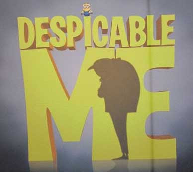
Despicable Me - Trailer


Watch Universal's trailer to Despicable Me!

- image source

Wednesday, July 15, 2009

Animation Mentor Newsletter - July 2009


New AM newsletter is out!

- Animation Mentor Goes Behind the Scenes of Blue Sky's Making of Ice Age: Dawn of the Dinosaurs
- Celebrate the Life and Work of Disney Legend Walt Stanchfield
- Short film Apprehension by Ziv Kitlaro
- Mentor: Mark Pudleiner
- Student: Cristin McKee
- Tips&Tricks by Shawn Kelly: Recipe for Success: Baking Your Animation Cake

Patrick Junghans' Waiting for Yesterday


Patrick Junghans sent me a link to his short Waiting for Yesterday. So far there is only a teaser up, but you should check out the Development Blog. It's always cool to see animation tests and how the clip changes from a rough version to a more polished one.

scn06_sht03-06_Rough from wfyfilm on Vimeo.

Jeff Gabor's Ice Age 3 Evolution Reel


Jeff Gabor has two fantastic clips up on his site, showing the evolution of his shot from layout to finished stage. Also watch the comparison reel for some awesome reference and animation. That guy is so good! (thanks Ting for the tip!)

Anim Stuff

- click here to watch some footage and a making-of of Chris Landreth's new short The Spine.

- Cartoon Brew had a cool post about a clip with Ralph Bakshi and Don Bluth discussion animation.

- Heavenly Appeals a short film by David Lisbe


- Upcoming Pixar has a good post round-up, from Up Designs to Music and Pete Doctor Podcasts. Cool stuff!

Friday, July 10, 2009

The Good Old Days


Nothing animation related, but this clip is making the rounds and it's a really cool look at how ILM was over 30 years ago.

www.vimeo.com/5494280

Thursday, July 9, 2009

New Planet 51 Trailer


Yahoo! Movies has the new trailer for Planet 51. Just like 9, I'm looking forward to that one (love Space stuff, give me that, Vampires and time travel and I'm good).

Monday, July 6, 2009

Critique - Mom & kid


Alright! Getting better and better!

Shot 1:

- woman: what sticks out the most are her eyes. She doesn't seem to focus on things, her pupils stay in the middle most of the time. It gives her almost a "blind" feel.
The first head turn feels good, but all the other head turns feel too spliney and even. It's just too computery right now. Did you film yourself acting this scene out? How is your head moving when acting out what she does? What are your eyes doing?
The hands/arms feel very ik-ish (especially the screen left one), so too floaty and the wrists seem too locked off. You could do a lot with fk, which will feel more natural. Careful with the screen right wrist doing a quick rotation around x164, it looks too mechanical and too isolated, break up the timing of it and slow it down a tiny bit as well.
I think I see some shoulder animation, but don't forget to add a bit more (for instance when she touches her hair, that arm going up would motivate the shoulder to go up as well).
- girl: same thing her with her eyes not focusing (lack of eye darts)
Wrists/arms feel too ik-ish (give-away when elbow is moving but wrist isn't).
Vary the jaw open pose a bit, same with the eyebrows and general facial aniamtion. Until she takes a bit her faces feel very locked into one pose.

Shot 2:

IK arm is really standing out here. The left elbow is floating around while the wrist is locked.
The eye movement is too slow. It's good to show eye darts because she's deconstructing information in her head, but the moves are too floaty. Keep the darts within 2 or sometimes even 1 frame (small distances).
Her body and head stop around x318 pretty much at the same time. Break it up, don't have body and head act like one unit. Again, act it out, how are you moving in that situation?

Shot 3:

I would bring in the mom a bit more into frame.
The kid's chair could be moved screen right as well (so that it doesn't cover the dog).
The dog's pose feels a bit weird, with the nose into the furniture and all. Think about what that one pose is supposed to show. Is the dog, just sleeping? Lazy laying down? Will the dog move?
The idea for the kid is fine, but it needs more complexity. The head rotates pretty much in Y only, there are no blinks doing bigger eye darts and head moves, the hand/arm gesture at the end feels to even and facially it could be stronger in terms of acting. It feels a bit simple, but it's clear. So add a bit more character to the kid. Right now it's a bit too default in terms of acting.

Hope that helps!
Cheers
JD

Thursday, July 2, 2009

Anim Stuff


Here a few interesting posts:

- Nancy Cartwright Interviews Brad Bird @ Upcoming Pixar

- Intro to Tales of Monkey Island @ Kotaku
There is some really cool animation on Buybrush!

- New Cloudy with a Chance of Meatballs Trailer @ Cooked Art

- Five making-of featurettes for Princess and the Frog @ Animated-News

- Funny Interview with Pixar's Angus MacLance @ Animated-News where the Megan-Fox-flower-kid gets mentioned

Wednesday, July 1, 2009

Fat-tastico - by Yung-Jui "Erik" Lee

Very cool animation! Check it out! Well done Erik!

Fat-tastico from gogoerik on Vimeo.


Find out more @ erikleeanimation.com

Critique - Monster Fight


Awesome!! But, even though it works for games, the timing overall is too fast. When I watch in quicktime and then adjust the playback speed to almost 1/2 (so maybe 30-40% slower), it feels much better.

The section between x10 and 20 is really cool.
How he hangs on around x40 is cool too.
The flip is neat idea.

Now, the hit around x100 is too fast, especially the creature's forward movement, it looses any sense of weight.

It's nice how he pushes the creature away around x180, but from x182 to 192 he's totally off balance. You need to move his right leg to the left like on x195 much sooner so he stabilizes himself. Once you do it earlier, you might have to add another step.

The creature specifically:

the pose on x37 is a bit odd, with the legs back and the hips forward, I'd rotate the hips down a bit more and move them back, because right now the move from x37 to 43 feels unnatural and ends abruptly on x43. The momentum of such a move would have the creature slow into the stop, the weight distribution would be cleaner.

From x63 to around 68 it's too pose to pose, plus the pose on 68+ is awkward. Is the creature trying to grab the guy, hence the "wrist clap"? If so, good idea, but make it clearer. Look at the silhouette on x68. Squint your eyes and you won't be able to tell where the hands are. The upper part with the chest, head, arms and hands is one big block.

The body move up from x87 to 91 is too fast and again stops too abruptly. All that mass will come to a rest in a slower fashion. This will get fixed once you slow everything down (as mentioned above).

From x126 to 136 the arm up move feels a bit odd and unmotivated, I think you could add a stronger pose to that. And then how it relaxes to x172 could work idea wise (agony filled spasms) but right now it feels like spliney keys from A to B, with no real purposeful timing.

His fall is cool, but it feels that the creature sticks on x187, I'd add more sliding and complexity.

That's it. All in all, really cool start!

Cheers
JD