Friday, October 31, 2008
Rocket Jo
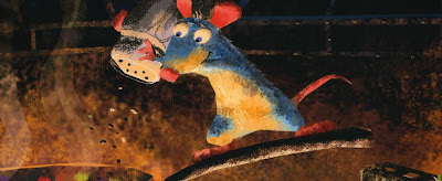
Cartoon Brew points to "Rocket Jo" by French Animator Julien Charles. Head over there for all the links, images and videos.
Critique - Cardboard
Looking good!
I think you're still fighting your IK rig though. Watch out that body parts don't look like they're moving independently.
- Let's start with the root:
There's a weird hip/lower body disconnection going on around x52 to x66, where the hip starts to float towards the left.
The root starts to move very quickly from x95 to around x108. The first move screen right needs to be slower, it needs to feel like she's leaning forward and then pushing back.
It then slows down after 108 to x118 where it suddenly moves quickly again to x121 where it feels like it's hitting a wall and moves straight down.
After the move to x150 the hip goes up till x158. That move feels like the hip rotates and squishes the lower body, but the upper body counters that move.
- now legs:
after fixing the root your legs will be a bit different, but make sure you don't have any overstretching or floaty legs.
For instance, x1, the screen right feels overextended, then pops into the move until x4, then stops. Watch out for the same leg on x55 where it's bent then extended the bent again. Another overextension is happening on x108.
The screen left leg after x134 feels very IK. The move up to x150 could have a nicer arc and slow into the stop. After that it feels very IK, slowing drifting around. What gives it that IK feel as well is the fact the leg moves around, but the foot orientation stays pretty much the same.
These areas stick out the most, so I would give it another pass of love.
Cheers
JD
Thursday, October 30, 2008
Pixar News
From Upcoming PIxar you get:
- "The Art of Pixar" is a very cool site which showcases the artwork for their movies.
- "Car Toons" shows you a few clips from the new TV show (as always, awesome animation!) - click on the MSN link, the youtube vids are gone (of course)
- Oscar race: now this one has me a little bit confused, check out the image:
"For your consideration in ALL categories..."? You mean make-up, FX, documentary, acting, etc.?
Wednesday, October 29, 2008
Anim tidbits - Delgo & Prince of Persia
"Delgo" - a project I first heard about years ago now seems to be getting an actual release, trailer below (with my favorite animation bit at 1 min 09 secs).
This is really cool: the 1985 reference footage for the original Prince of Persia. I remember how the animation for this game blew me away. - found @ Kotaku
Prince of Persia Animation Reference 1985 from jordan mechner on Vimeo.
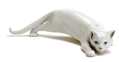
And finally, this is totally random, but I really like the pose in that picture (Google is your big friend for reference)- pic found here
Friday, October 24, 2008
Critique - Chair
Hey,
looking much better! Nice!
Alright, let's start with the root:
from x1 to x28 you might want to give it a bit more life, it's a tad floaty. Then around x28 it seems to pop back screen left and stick there till x32. After that it moves in a very straight line screen right until x40 and suddenly stops.
Always remember that pretty much all movement is following an arc (even if the arc is tiny). So if you do a weight shift over a leg, it will push the pelvis up over it as you do it. And overall, you don't want a straight line in CG land, it looks too robotic.
Anyway. The sit down is cool, but needs a bit more love. I like how slow and labored it is and how sudden his stop is (he doesn't look fat, it's not like his big butt would serve as cushioning - it's more like bone on wooden chair). So now you need to add a bit more polish to it. Start slow with the descent but speed it up as it gets to the chair (because of gravity and his muscles weakening over time). The impact would need one or two frames softening. So keep that key on linear, break the tangent, but add 2 frames of him going down in Y so it doesn't look like he's hitting a wall. When he actually hits the chair, add some overlap to the head, so you can feel the impact. You don't want the head to be all stiff.
When he leans forward from x100 to x124 his hip is not moving, make sure that you don't let it die. In an older version you had him lift his shoulders a bit as his arms move forward, which was nice, put that back in there.
Now the upper body.
After x24 to x33 he leans forward very quickly and then stops. I would slow that down a bit and keep it alive as he grabs the armrest. The other reason why it feels fast is because there's so much mass moving. You're moving the head and the upper body as one unit. You need to break it up. The head can drag or lead, rotate around, etc. as the body moves.
Legs:
Since your timing of the root will change, it will affect the legs, but either way, make sure that you don't overextend them, like on x38. You don't want legs pop in and out of hyper-extension. Besides the pop you'll also get the feet to move up, because of the sticky IK. The screen left foot adjustment on x51 feels odd. I wouldn't treat it as a step, it's more of a shuffle or foot adjustment. So point the toes down instead of up (makes it look too exaggerated otherwise). Keep the foot alive as he sits down. Looking at the screen left leg from x62 to 75, it really bends over, yet the foot is stuck to the floor, which yells IK.
Always think about how each part of the body affects the surrounding parts.
Speaking of IK. The hand that grabs the armrest (make sure you don't overextend the arm around x44) is super locked from x54 to around x77, which is ok because it's holding the armrest firmly, but what kills it is the elbow. I would steady the elbow movement with the polevector, but always tie it in with the body movement, so it doesn't feel to separated.
The screen left arm is going through the chair geometry around x80.
Hands:
Fix the wrist and fingers around x79, they seem to go through the arm geometry. The hand moves away for the chair from around x80 to x92, where the screen left translation suddenly stops. Keep the arc going, don't make it look like the hand hits a wall.
The other hand needs a nice pose, he looks like he's holding a wine glass like a beer mug. :)
So do another pass with those fixes and then we go from there.
Cheers
JD
Thursday, October 23, 2008
New Madagascar: Escape 2 Africa featurette
Animated-News points to AWNtv for the new Madagascar 2 featurette. Too bad that the marketing is so focused on the "Move it" song, they should show more of what is shown in the featurette, beautiful landscapes, variety in the creatures, etc.
Wednesday, October 22, 2008
An Evening with Animation Legend Richard Williams
Date From November 02, 2008 7:00 PM
Until November 02, 2008 10:00 PM
Location
Balboa Theatre
3630 Balboa Street
San Francisco, CA 94121 [map it!]
Info Line 415.221.8184
Website http://balboamovies.com
Contact Roger Paul
3630 Balboa
SF , CA 94121
415.221.3117
roger@balboamovies.com
Description
AN EVENING WITH ANIMATION LEGEND RICHARD WILLIAMS
WINNER OF THREE OSCARS
AUTHOR OF THE ANIMATORS SURVIVAL KIT
ANIMATION DIRECTOR OF WHO FRAMED ROGER RABBIT?
SUNDAY, NOVEMBER 2, 7 PM
BALBOA THEATRE, 3630 Balboa (at 37th Ave in SF), $9.00 (kids & seniors $6.50)
A benefit for ASIFA-SF, the Bay Areas Animation Association
Williams has been in the animation business for over 50 years. He created the Oscar winning A Christmas Carol, directed the animation in Who Framed Roger Rabbit? (two more Oscars), created memorable opening titles for features (The Return of the Pink Panther, The Pink Panther Strikes Again, Whats New Pussycat, Casino Royal, The Charge of the Light Brigade), award winning TV commercials, and other projects including the feature Raggedy Ann and Andy.
As the head of an award-winning studio producing animated commercials for many years he constantly strove to improve the quality of his art. This resulted in his hiring retired Hollywood animators to teach a new generation of artists the craft at his studio. For years copies of lecture notes from these classes were passed around from animator to animator. Then in the 1990s he toured the world presenting The Richard Williams Masterclasses. That result in his best selling book The Animators Survival Kit (2001) that is a standard reference for any animator today. Now a 16 disc DVD boxed set of his classes taped as he presented his lectures to employees at Blue Sky Studios in NY (with over 350 animated clips and other features added) is about to be released.
Tonight Richard Williams will be talking about the principles of animation and illustrating then with excerpts from his new DVD set The Animator's Survival Kit Animated. His wife Imogen Sutton writes, We have had terrific reactions to this program at Blue Sky Studios (all animators) and at Pordenone where there was a general film audience of historians, archivists, academics etc. Dick usually tries to demonstrate by acting things out where necessary - he doesn't like to just stay seated. We expect the show to run between 90 minutes to 2 hours including lots of Q and A. Everyone will get a complementary DVD about Williams new work. Dont miss this is once-in-a-lifetime presentation.
Karl Cohen, author, SF State instructor and president of ASIFA-SF, will moderate the program. This program is a benefit for ASIFA-San Francisco, a member of the Association Internationale du Film dAnimation with almost 40 chapters around the world. We are a volunteer run group that presents monthly events (special screenings, lectures, networking parties, etc.) and publish a large informative monthly newsletter. For more information about us visit us at www.asifa-sf-org
http://www.brownpapertickets.com/event/47295
Tuesday, October 21, 2008
abxPicker
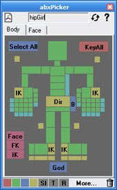
Here's a quick reminder to check out the "abxPicker" tool that was mentioned yesterday. It's a huge time saver and you should definitely add it to the list of your workflow tools. I added it to the MEL section @ Animation Buffet, so head over there for more details.
Anim stuff - Madagascar 2 Music Video, Secrets of Body Language, etc.
- as always, make sure to check Carlos Baena's site as often as you can. Great reminder about "Secrets of Body Language" on the History Channel. He also posted the first part of "Eyes", which is definitely worth your time.
- really cute 2D short: "The Chestnut Tree", which I found through Victor Navone's blog.
- "I like to move it, move it." Dance Video for Madagascar 2.
Sunday, October 19, 2008
"Bolt" - New Chase Clip
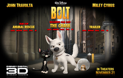
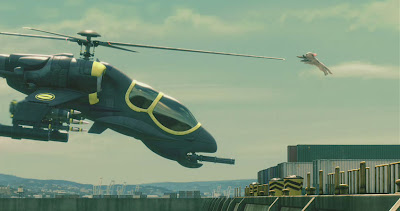
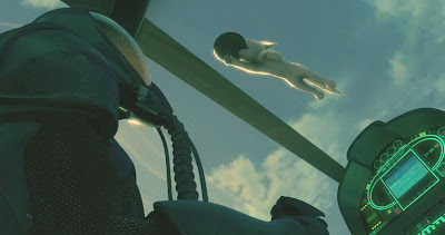
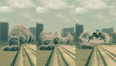
Animated-News points to a new clip showing a really cool chase sequence in Disney's "Bolt". It's a very fast paced and exciting sequence with a very modern James Bond-ish score. The animation is great, I'm really getting more and more excited about this movie.
The level of detail is really cool, watch how the smoke reacts to the chopper:
Critique - Train
Hey,
nice work!!
You could split it up into two pieces, but I like the timing overall, so I don't think you'd HAVE to present it in two parts.
Since it's so good, I'll be a bit more picky. :)
Watch the screen left arm at x13. As you move his body and arm up to this frame, it gets to a sudden stop. So on x14 and 15 I would continue a little movement in his arm so that the momentum keeps going, just like you have it in his wrist (which now looks a bit too isolated, since the arm is not moving). It's hard to tell at this size, but it looks like around x15, as he holds that pose, his left screen hand fingers are curled. It looks like he's gripping something, but he's not. I would open up the fingers a bit more, so it's more of a balance thing, less of a fist.
You have a big arm movement from x18 to 19. I would drag the hand more on 19, then rotate the wrist more clockwise on x21. Lower the shoulder on x22. You're overextending the arm until x24. It's cool how it snaps into that pose, but looks a bit uncomfortable with such an overextension. No need to bend the arm like crazy, just give it a hint. Maybe you already have it, but it's away from the camera, so move the elbow pole vector.
When he gets stuck from x60 to x77 he keeps the same facial expression. I would open his mouth from 60 to something, to extend the shock that goes through his body (extend the screen left fingers on x63/64 as well - imagine the shockwave going through the entire body, exiting through the finger tips; right now your fingers are always curled). You can always close the mouth again as he turns around.
His left leg hop from x64 to 71 is too slow and even. It doesn't really look like his lifting his foot off the ground either. I would make it a bit faster and add more weight. You don't have to lift it, but at least change the rotation (move heel counter clockwise).
You're overextending his right arm from x117 to 189. You can go into that extension a tiny bit smoother and have until x130, but when he relaxes the pull and starts looking back towards us, it feels very awkward. Especially on x134 when his shoulder pops back. It's as if the arm is can't bend and is pushing the elbow back. The hand is not locked though, it doesn't seem to hold on to anything, which makes that extended arm look even weirder.
Look at x210, the screen left shoulder could be move forward. All you can see is that little ball geometry and gives the left side of his body a harsh silhouette. Rotate the shoulder forward. If that starts to bend his left arm and you want it straight, then move the elbow up or down so that we don't see the bend (although I wouldn't mind a tiny bent arm).
The shake of the metro around x221 is pretty small, his move to x231 just feels too exaggerated. It's very "animated" because the reaction to the bump is huge and how he starts that motion is slow, which makes it look even more like he's not really reacting to that bump, but more acting to that bump.
Watch the screen right hand finger curl from x246 to 290. They are in the same curled position throughout, you could sneak in a few nicer poses. Then on x274 the hand/arm feels IK-ish. It could just be a visual thing, but with that hand rotation up after x275, then having the body move but the hand stay still from x282 to 284, it looks too locked. Give it more life during that section.
The paper flutter-fly-away and his bent hat is awesome during the x300 part. :)
You're giving away the IK again on his right hand from x305 to 307 by having his elbow move that much, yet his hand is stuck on the window.
You said you're still working on x330 till the end. I would add bigger fist hammering moves. This is the final climax and he feels a bit tame during that last section. You could also have him mouth "NOOO!!!!" for some facial contrast at the end.
Phew! Hope that didn't kill you. But again, it's looks awesome!
Cheers
JD
Critique - Sitting down
Hey,
it's a bit tricky to start in the middle, but if it works for you, go for it.
I would not have changed the camera, because if this is not the final angle, then it makes no sense to critique certain parts like silhouette. Stick with the final camera and work with that one. But I can still comment on timing:
It's really nice when he touches the seat and moves his arms and leans forward, there's some good timing in there.
The beginning feels a bit stiff in the upper body and head area, you might want to break up the timing of each part, maybe leading with the head a bit more. After x29 you definitely need to keep the head separate. Right now from 29 to about x40, his head and upper body, as well as the upper arm, all move as one big unit, which makes it look stiff again.
Around x54 to 68 you have a rotation in the upper body which makes his head swing around very fast. As he leans forward you could rotate the head up a bit so that it's again not one big body/head unit. I like the shoulders though, how you bring them up as his arms go forward.
The hand that holds on to the chair feels to IK-ish, it's too locked. Especially when he lets go off the chair. You keep the fingers the same and the hand rotation is very slow from pose to pose. And even in blocking, make sure that your character is not going through geometry (screen right arm from x92 to 112).
I would lower the root a bit more overall in order to avoid the overstretching of his legs. That way you can do more up and down and weight shift as he takes the first step before he sits down. That part needs a bit more sense of weight.
Hope that helped!
Cheers
JD
Critique - Acting
First, the cardboard clip:
the hand movement from x10 to 15 happen at the same time for both of them, so offset one by 2 frames or so. The screen left hand could be less bent upwards, so that you get a nicer finger silhouette.
You might still be fighting your IK rig. Look at her hips on x32. As it goes down it looks like she's scaling down in terms of proportions. Try to keep the volume consistent. Also, look at her lower body how it travels screen right, but then on x39 it stop and goes just down. But after that she goes forward again around x41, 42. But this time it looks like the lower body stays put and only her chest goes forward.
Her move backwards is too sharp and quick on x100 to x103. Especially 101 to 102 is a big move spacing wise. Plus it's the whole body, there is no staggered movement between the sections of the body and her head.
Same goes with her head on x116. Since it's such a big mass, when she lunges forward from x116 to around 122, it feels too fast.
It would tone down her should movement and add some chest movement during x155 to 161. The screen left shoulder goes to the right, her head goes to the left. Two very big opposing movements while the rest of the body is pretty still. It's touch to move your shoulder in such a broad way without any upper body movement.
I would lock down her left hand fingers a bit more after x146. They seem a bit wiggely and loose. It looks like there is a little spider moving on top of the biceps. :)
Now the Rudeboy:
Great start, very promising! You said it's in a very early stage, so some points you might be already aware of, but I'll mention it anyway.
First, in last class we mentioned that his "tough road" fist gesture is a bit too "acting out words" (plus the movement is super fast over single frames). I think you can sell it through his face alone.
I would angle down his foot a bit more. It's very flat and IK-ish, so it's super locked and seems to rest on the lower frame of the movie. You can also zoom out a tiny bit more if needed.
But overall what sticks out is his head. Your reference was working better because your head is smaller. Seeing it now animated it feels like it's moving too much during the second half of the clip. You lean it to the right during "easy road", over screen left before "... it's a rocky road...". then to the right again. So during this section it's just a big mass moving a lot. I would keep the first one, then nothing during "rocky road" and maybe a little bit during "tough road", but just to accentuate the facial acting.
But again, great start!
Thursday, October 16, 2008
Project updates
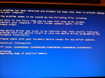
Remember my "Upcoming Post" ... post? Yeah, it's been a while. And guess what? I'm still having computer troubles, despite a new machine.
We thought it was the graphics card, then power supply, then OS, etc. Well, we put a new configuration together and I'm going to test it this week-end. Wish me luck!
Anyway, even if this might sound like a broken record, I really want to get going with these planned posts and one day I'll get them done. :)
Latest hiccup (but a positive one) is the fact that I'm working on my first show as a Lead Animator. As you can imagine I'm a lot busier at work, so instead of posting things during a render, I got new things to do.
So again, sorry for the lack of posting. The next bigger post will probably be about "Dirt". I'm preparing it for our "No Continues" project and I might as well construct it so that I can post it here as well. Dirt, or keep alive, or noise, or whatever you want to call it can help your shot in terms of getting a step closer to realism. This is of course style specific (you won't see many imperfections in a cartoony movie) and those added imperfections might not be what you're looking for, but it might be interesting for other people.
And yes, the workflow demo is on my list, but before that, I can post a section of my "Grading Reference" post (From F to A, what does it look like, what am I looking for, etc.). Stay tuned!
Cheers
Jean-Denis
Animation Mentor Newsletter October and other anim news
The new "Animation Mentor Newsletter - October" is available! You get:
- Networking in Animation
- "Eyes and Blinks" The Keys to an Emotional Performance"
- Short: "Night Crossings" by Rob Tighe
- Mentor: C.J. Sarachene
- Student: Bruno Monteiro
- Tips & Tricks: Who is cut out for Animation? (Answer: YOU!) Awesome, read it!!
Other anim news:
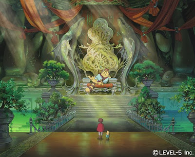
Head over to Kotaku to watch the Studio Ghibli/Level 5 game trailer for "Ninokuni". YEAH!
Upcoming Pixar says that Leslie Iwerk's documentary "The Pixar Story" will be on iTunes soon. SWEET!
New "Resident Evil: Degeneration" Trailer! TASTY!
Lastly, check out David Weinstein's blog, cool animation links, tutorials, etc.
Wednesday, October 8, 2008
Bobby Pontillas Interview
Head over to Character Design, which has a great interview with Bobby Pontillas. The site has awesome artwork up plus many animation clips showing the planning, blocking and polish phases. The shots show great use of camera, focus changes, lighting, etc. nothing huge or distracting, but enough to make it look cool. You'll see clips dealing with weight, pantomime and dialogue acting. Definitely check it out.
Monday, October 6, 2008
Another round of anim stuff
Watch the new Madagascar 2 trailer here!
Check out Framepool - Motion Content if you need reference fotage (thanks Erik!)
Halo Wars cinematic, watch it here!
"A Short Love Story in Stop Motion", make sure to watch it here.
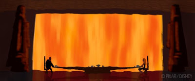
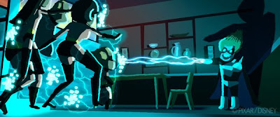
Lou Romano offers more insight into the concept phase of "The Incredibles". Lots of awesome images, check it out here.
Wednesday, October 1, 2008
Anim stuff all over
New Bolt poster from iwatchstuff. Remember the half closed eye lid talk in class? There you go.
- Make sure to check out Jeff's blog on a daily basis,this time he got a great "quadraped walk cycle demo" and thoughts on what type of clips you could be doing purerly in terms of exercises, "The benefit of practice".
- Followers of my blogs know that I love concept artwork, so of course I was very excited to check out the "Sketchbook of dshong", which was forwarded by a co-worker (thanks Steve!!).
- Alonso points to very cool posts about "Original Characters", "The Anatomy of Story", "Five C's of Cinematography" and much more, so head over there.
- This is just too cool. Studio Ghibli and Level 5 team up for "Ninokuni", a Nintendo DS game. Kotaku has screen caps, concept work and more!
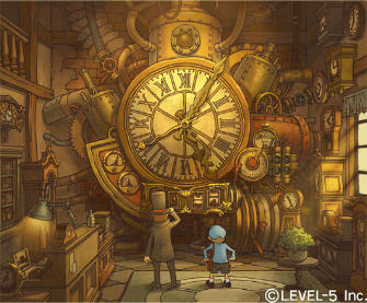
- Head over to Kotaku to watch the new "Professor Layton 3" trailer (for the Nintendo DS). I still have to get the first one
Subscribe to:
Posts (Atom)