This post is exploring an area where keep alive is taken a step further into a messier realm and where even normal movements, which traditionally follow beautiful arcs, get the occasional hiccup. I can't think of a formal name for this, I usually just say "Dirty up the animation", or "Add some dirt...". Adding "dirt" to your animation is basically the license to be sloppy, but it's controlled sloppiness. It doesn't mean you can now stop cleaning up your animation or forgo polish. Even in chaos there is logic, so think of "dirt" as another layer of polish. Adding "dirt" doesn't change your animation dramatically, there won't be a wow effect once you apply it. It's more of a subtle addition to your animation, but it can make a difference style wise.
Speaking of layers, the latest version of Maya allows you to add animation layers, which can make this process a lot easier. If you don't have layers, or extra controllers above your main controllers, etc. don't worry about it, the principles are the same, regardless of the tools.
This is by no means a definite how-to, but more of an insight into how I go about it. It's probably all wrong and backwards, so feel free to leave comments if you have any questions or suggestions.
When and why do you add dirt?
I usually start adding dirt when a character is not moving that much, for instance when a character is just standing around. Or to specific body parts that are still, so they don't stop moving and freeze up. You can also go a step further and go beyond keep alive and add dirt to certain movements, in order to get rid of the clean CG look. But it all depends on the look and style of the project. You don't always need dirt, nor do you always have time and money to add much detail to your animation. Depending on the style, you can actually get away with a lot (... or nothing).
For instance
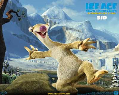
South Park:
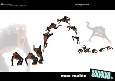
The style is simple, so any fancy animation isn't needed, it would just add a funny contrast. Funny enough though, there is more "dirt" in a south park episode than in one of my childhood shows, Knights of the Zodiac (a.k.a. Saint Seiya).

 cool pose on that toy
Here are two clips:
The animation is minimal, a few key poses and holding the last pose until a new movement starts. Common for TV animation. Super smooth animation would be cool, but is not needed. Photo real animation would be weird though. All in all, the animation fits the style, although it is VERY minimal (more so than South Park at times). There are other moments in the show where the animation is more complex and it wouldn't hurt to be like that throughout the whole show, but that is usually not possible on a TV budget.
The more (photo-) real a character (and the environment) looks like though, the more detail needs to go into your animation. The movements have to have more life like timing and complexity, otherwise there is a jarring disconnect between style and animation. You obviously don't have to agree with that statement and I'm sure that there are exceptions out there that will prove me wrong. It's just my opinion. And yes, I know, story goes a long way. At the end of the day, who cares about how it looks if the story is great? I'm a huge fan of South Park: The Movie and that movie sure got away with a lot.
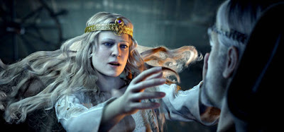
To me the disconnect starts when you have that much (realistic) detail:
... combined with stylized design:
... and exaggerated animation like this:
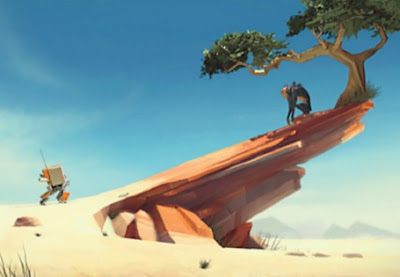
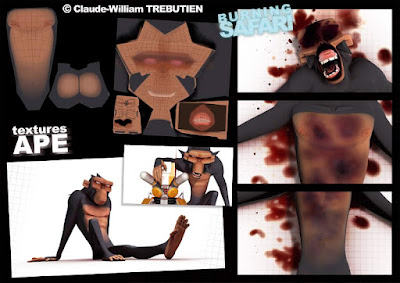
I like the design by itself and the animation is great, but compared to the level of render detail (especially compared to the environment), the animation is too stylized for me. All you have to do is tone down the detail level and bring it "down" to "Burn Safari" level (which is not meant in a negative way):
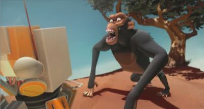
And here the clip:
Even here you could go simpler look wise. But again, that's just my personal preference and I can imagine that I'm in the minority with that opinion, since pretty much all feature movies are going for a near photo real look despite the cartoony animation:
 (look at the texture on the tongue)


 (click on the images for a larger version)
This pet peeve of mine is not just focused on the render, but extends to areas which are simulated, like cloth and hair (as well as water, smoke, fire, etc. etc.). I wish that hair for instance was animated to flow with a purpose, just like the character instead of just being a cold sim. I know, I know, do you really want animation controls on hair, cloth, water or fire? Well, to be honest, sometimes yes, for specific moments, but I understand the technical difficulties of adding these features. Anyway, enough ranting.
[I started this tutorial a long time ago I had ample time to discuss my said preference with friends and coworkers and it really looks like I'm the only one that has this "problem". Hahahaha! Oh well. And no, it's not a dealbreaker for me. It's not like I'm not going to watch a movie because of it or it diminishes the quality of the movie.]
It's all about the style of the project (I'll repeat this a lot throughout this post), so be careful about how much dirt you're going to add. Does it fit the style?
Here's another turnaround example from The Incredibles:
Definitely more complex then South Park and Saint Seiya. :) Both the scared thief and Bob keep moving even though they are just standing there and it works well with the style. Clearly the thief has to move more (the scare is not a shock) but either way, if you would hold the pose without any keep alive, they would look dead.
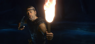
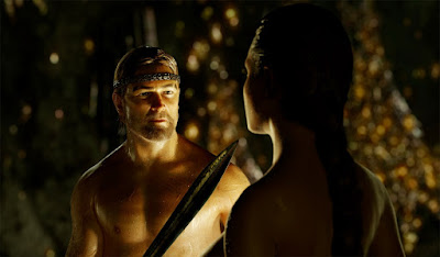
Let's look at an even more realistic example style wise. For instance
Beowulf:
 (click in images to see them in hires)
As you can see the look is very real, so to me the animation has to mirror that. It would look ridiculous to have super snappy cartoony or minimal animation with a look like that. I can't imagine you would disagree. The animation has to be as real as possible and this example clip works really well (whether you like the mocap approach or not, and yes, you might as well shoot it as a live-action movie).

Pay attention to both hands. If you would track the arcs and the spacing, it would be very jittery. The sword arm after the turnaround has a nice dirty settle. The second part, where he suddenly looks up screen right has a nice stutter in his head and chest. These imperfections make it more life like and believable. The style of movement fits the style of the character and environment. But if you go for such a realistic style, you will have to work extra hard to make the facial features work, so all the dirt and imperfections and twitches, etc. that humans have need to be in there, otherwise your character dies.
So think about the style and medium before you start putting a lot of dirt in your animation. Again, it's not always needed, it all depends on the style:
_________________________________________
So. Now to the
technical aspect.
Where do you add dirt?
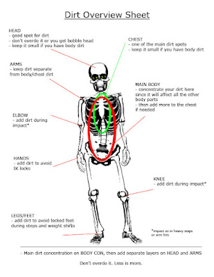
- root
- head
- arms (hands)
- legs (feet)
I don't really add dirt to shoulders, the hips or the face. Depending on how close the camera is to your character, you could add some dirt to those parts, as well as the fingers (or jaw during certain moments), but that gets into a very detailed aspect where you take it as far as realism (or your client) dictates it. It's more about the basic look and feel, don't overdo it.
Most of the time I add it to the root, the head and the arms. That gets you pretty far. Depending on the action (once you go outside of just the "adding dirt to a hold" realm), you might have to add it to feet and hands, for instance during steps and grabs. This is where I sometimes overlap dirt with regular detail work or polish. After a while the techniques start to bleed into each other, but more on that later.
How do you add dirt?
Either directly using the rig's controllers or by adding keys in the graph editor and tweaking the curves from there. It all depends on the motion and how comfortable you are with this process.
For some actions you can even use a "set random keys" script, like
"Shaker". Wait, there is a script that can help me out? Yes, but you still have to do a lot of work on your own (if you have a channel in Maya that is locked,
Shaker will barf on you, so make sure that your Translate and Rotate channels are unlocked).
Hold on, did it say "random" in the above paragraph? I thought every movement in animation needs to have a purpose? Well, to me, yes and no. Sure, every little move can be motivated by breathing, muscle spasm, weight shifts, etc. so technically the dirt you put in is not random. But that's going too far in terms of analyzing the movement. Maybe it's just me, but I'm not going to rationalize every little move of my character. For example, stretch your arm out and point to something with your index finger. Now look at the tip of the finger. It's moving around. Randomly. That's good enough for me. So my keys will be random as well. :)
No matter what though, get your basic animation done first. The dirt layer gets added during the polish phase. You don't want to spend all that time adding detail before your blocking has been approved (by yourself, the lead, supervisor, client, etc. ). So:
- planning
- blocking
- refining <= here's where you're adding dirt
Depending on the project or client, you might not have time to add dirt, because your schedule could look like this:
- planning
- blocking
- redo blocking
- redo blocking
- redo blocking
- redo blocking
- ...
- there is time for refinement?
So don't waste time on that awesome ambient move of your character's left pinkie before you nail down the basic performance!
And when do you add it again exactly?
- whenever a body part is not moving for added keep alive
- whenever a body part is holding a pose to avoid a "frozen" look
- whenever your character quickly transitions from pose A to pose B and stays in pose B for a while for a more life like settle
- etc.
You're basically adding complexity to movements, transitions, settles, etc.
- once you are used to the process: during posing of your character to get away from the default pose
The more comfortable you get with the process the more you will start sneaking in dirt during the blocking stage (in small amounts though and during low-action movements), but again, get your basic animation right. The foundation has to be solid before you start adding detail stuff.
So how does this look like?
Alright, let's look at a few examples.
- whenever a body part is not moving for added keep alive
For instance: a character is just standing around. This is a good opportunity to use the above mentioned script,
"Shaker".

As you can see, all I'm adding is random movement to the body, so it doesn't look dead. The character isn't doing anything, there are no arcs I need to preserve. This is just basic keep alive and for that kind of work the script is great. You'll also notice that the movement is very subtle. It's more about feeling it than seeing it. No movement at all on a CG model can make it look dead (depending on the style of course), so any little movement will help. There is no mathematic rule as to how much or how little dirt you need to add, that's up to your judgment and/or the person you're working for.
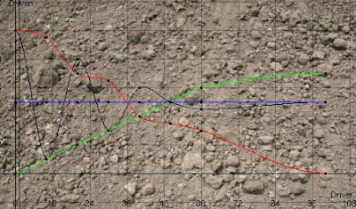
Once you get used to the process you don't really need the script anymore because you're faster at setting random keys by hand. Here's a clip with the default Shaker settings (except shot length) on the left, then with adjusted curves to get more of what we want in the middle and on the right the whole thing done by hand.

The more you use dirt in your animation, the more you get a feeling of where and when to add it, so that after a while you won't have to use the script, except if it saves you time. Imagine your character is just standing around like that for 1000 frames. You'd either do a little section as a cycle and then copy/paste the animation, or set your script to run for the whole shot length, but you wouldn't add random keys to your curves and controllers by hand for the duration of the shot.
Even when adding dirt, you want to start with the basics and then adjust the movement depending on the camera, character position, etc. Here's a vidcap of the basic setup, where I set random keys on the body controller, arms, head and chest. You can then adjust the keys in the graph editor to get the movement you need, or you move the body parts directly. Either way won't be perfect from the get go, you will always have to adjust and rescale the keys.

(this clip is long and pretty boring, but I added it for those who really want to see everything)
You will also see that the added dirt in a full body shot can be too much once your character is closer to the camera. The further away from camera the character is, the less detail is needed of course, so don't go crazy with all the dirty work for something you won't see. Always be aware of what your shot needs and where you're character is. You don't want to spend precious time adding dirt and forget that your character is hidden by something or someone.

And there are moments where you know you will have to exaggerate it more in order to be felt/visible. Camera moves can really force you to go beyond what you think should work because whatever subtlety you have in your animation might get canceled out by the camera move. Here's the same idle character but with a moving camera:
As you can see the added dirt/keep-alive is invisible, so you'll have to adjust your animation.
Let's move on to another example.
- whenever your character quickly transitions from pose A to pose B and stays in pose B for a while for a more life like settle
For instance: a character is pointing at something.

As you can see the differences are subtle but the feel is different. Now, adding all that messiness can make the character look older maybe, not as forceful, or having the extended arm move around could take the focus away from the face, etc. etc. so make sure that the added dirt doesn't compromise the original intention of the shot.
What about:
- whenever a body part is holding a pose to avoid a "frozen" look
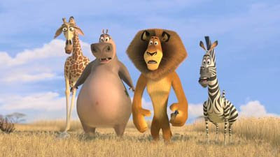
A good example would be the above
Madagascar clip, where Alex has a slight drift in his arms and body before he gets out of that pose. Without that subtle move the character would feel frozen and dead. Again, depending on the style and focus, you can dirty up that pause/drift if needed. It can be any gesture or pose that is being held for a few beats.
_________________________________________
This next part is blurring the line between animation detail and dirt addition. When you have movements like a step or a hand plant, you want to make sure that you don't reveal any IK solutions or have the feet/hands locked (of course you might have no choice depending on the style or time constraint, budget, etc.).
But adding detail and complexity to such a move is just part of the polish phase and something that you should be aware of as an animator, dirt or not. So it's not quite accurate to call this dirt, but I still do it. And this is where the blurry part comes in. For some it's just a normal thing to add to their animation. I'm just used to say: "Make that step dirtier." or "Dirty up that hand plant."
So for the step it would be something like this:
The more you add dirt and complexity to it, the more you alter the original vision (for instance if you add a little side step), so make sure that you don't add too much, unless your lead, supe, client, etc. is okay with it.
_________________________________________
Don't forget: don't overdo it. Keep the animation style in mind. Don't apply dirt to all body parts, only to the areas that are needed. If you can feel it more than see it, that's okay! And here a little cheat sheet:
That's it! If you have any questions, don't hesitate to ask. Hopefully it made sense. :)
Cheers
JD


